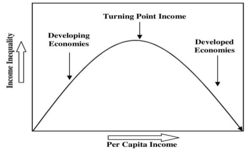
Kuznets Curve is used to demonstrate the hypothesis that economic growth initially leads to greater inequality, followed later by the reduction of inequality. The idea was first proposed by American economist Simon Kuznets.
As economic growth comes from the creation of better products, it usually boosts the income of workers and investors who participate in the first wave of innovation. The industrialisation of an agrarian economy is a common example. This inequality, however, tends to be temporary as workers and investors who were initially left behind soon catch up by helping offer either the same or better products. This improves their incomes.

The Lorenz curve is a way of showing the distribution of income (or wealth) within an economy. It was developed by Max O. Lorenz in 1905 for representing wealth distribution.
The Lorenz curve shows the cumulative share of income from different sections of the population.
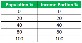
If there was perfect equality – if everyone had the same salary – the poorest 20% of the population would gain 20% of the total income. The poorest 60% of the population would get 60% of the income.
The Lorenz Curve can be used to calculate the Gini coefficient – another measure of inequality.
Example of Lorenz Curve
Following is the example to understand the Lorenz curve with the help of a graph.
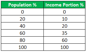
Let us consider an economy with the following population and income statistics:
And for the line of perfect equality, let us consider this table:
Let us now see how a graph for this data actually looks:
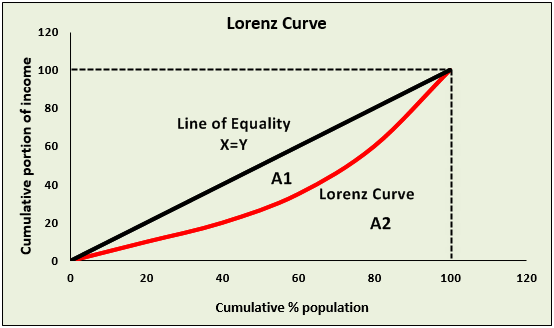
As we can see, there are two lines in the graph of the Lorenz curve, the curved red line, and the straight black line.
The black line represents the fictional line called the line of equality i.e. the ideal graph when income or wealth is equally distributed amongst the population.
The red curve, the Lorenz curve, which we have been discussing, represents the actual distribution of wealth among the population.
Hence, we can say that the Lorenz curve is the graphical method of studying dispersion.
Lorenz Curve can be used to calculate Gini Coefficient.
The Lorenz curve is the Visual Indicator and
The Gini Coefficient is the Mathematical Indicator.
Uses of the Lorenz Curve
The Gini-coefficient is a statistical measure of inequality that describes how equal or unequal income or wealth is distributed among the population of a country. It was developed by the Italian statistician Corrado Gini in 1912. The coefficient ranges from 0 (or 0%) to 1 (or 100%), with 0 representing perfect equality and 1 representing perfect inequality. Values over 1 are theoretically possible due to negative income or wealth.
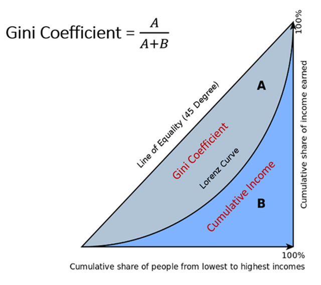
As mentioned earlier the Lorenz Curve can be used to calculate the Gini coefficient.
The Gini coefficient is area A/A+B
lorenz-curve---a-b
The closer the Lorenz curve is to the line of equality, the smaller area A is. And the Gini coefficient will be low.
If there is a high degree of inequality, then area A will be a bigger percentage of the total area.
A rise in the Gini coefficient shows a rise in inequality – it shows the Lorenz curve is further away from the line of equality.
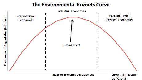
The environmental Kuznets curve suggests that economic development initially leads to a deterioration in the environment, but after a certain level of economic growth, a society begins to improve its relationship with the environment and levels of environmental degradation reduces.
From a very simplistic viewpoint, it can suggest that economic growth is good for the environment.

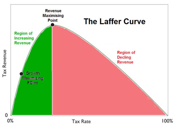
The Laffer Curve states that if tax rates are increased above a certain level, then tax revenues can actually fall because higher tax rates discourage people from working. The Curve was developed by economist Arthur Laffer to show the relationship between tax rates and the amount of tax revenue collected by governments. The curve is used to illustrate Laffer's argument that sometimes cutting tax rates can increase total tax revenue.
Laffer Curve states that cutting taxes could, in theory, lead to higher tax revenues.
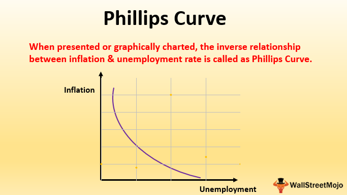
The Phillips curve is an economic concept developed by A. W. Phillips. It states that inflation and unemployment have a stable and inverse relationship. The theory claims that with economic growth comes inflation, which in turn should lead to more jobs and less unemployment. However, the original concept has been somewhat disproven empirically due to the occurrence of stagflation in the 1970s, when there were high levels of both inflation and unemployment.
KEY TAKEAWAYS
The Phillips curve states that inflation and unemployment have an inverse relationship. Higher inflation is associated with lower unemployment and vice versa.3
The Phillips curve was a concept used to guide macroeconomic policy in the 20th century, but was called into question by the stagflation of the 1970's.
Understanding the Phillips curve in light of consumer and worker expectations, shows that the relationship between inflation and unemployment may not hold in the long run, or even potentially in the short run.
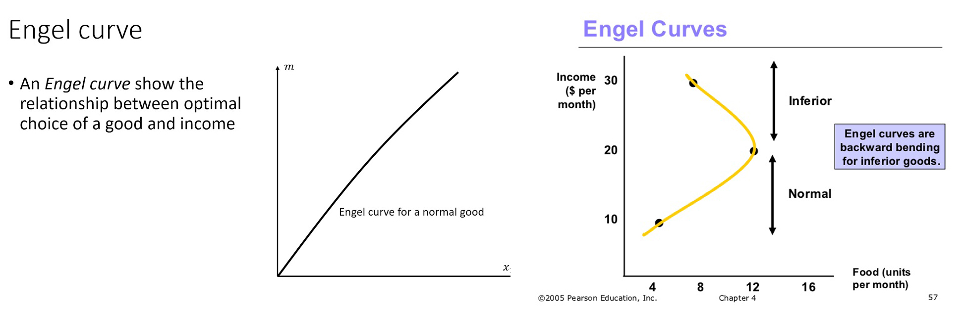
The Engel curve describes how the spending on a certain good varies with household income. The shape of an Engel curve is impacted by demographic variables, such as age, gender, and educational level, as well as other consumer characteristics.
The Engel curve also varies for different types of goods. With income level as the x-axis and expenditures as the y-axis, the Engel curves show upward slopes for normal goods, which have a positive income elasticity of demand. Inferior goods, with negative income elasticity, assume negative slopes for their Engel curves. In the case of food, the Engel curve is concave downward with a positive but decreasing slope.
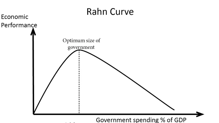
The Rahn Curve suggests that there is an optimal level of government spending which maximises the rate of economic growth. Initially, higher government spending helps to improve economic performance. But, after exceeding a certain amount of government spending, government taxes and intervention diminishes economic performance and growth rates.
The wage curve is a graphical representation of unemployment levels and wages when presented in local terms or for a specific region. It is seen that there is a negative relationship between the levels of unemployment and wages.
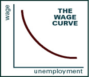
Wage curve, in simple terms, summarises the fact that a worker who is already employed in an area where the unemployment rate is high earns far less compared to an area or a region in the country where there are fewer jobs available. Labour supply is a function of wage rate. The higher the wage rate offered, the more is the supply of labour evident.
This happens because it gives an individual the incentive to work for some extra hours if the need arises. Under normal circumstances, a labourer for a specific task gets Rs 100/hr. This is the wage rate at a time when there is no shortage of work and the workforce is available even for working some extra hours. Let’s assume a scenario where there are not many jobs in the labour market.
The unemployment rate is high, which means that lot of people who want to work are underemployed. In this situation the prevailing wage rate would be much less than what a person earns under normal circumstances, which is Rs 100/hr.
Due to the high level of unemployment, the current rate is much less than Rs 100 per hour. The person who is employing can now hire more labourers to perform a set of tasks because there is excess supply in the region.
To sum up, when there is less unemployment and fewer labourers available to work on a specific task, the wages then for that given task turns higher. On the other hand, high unemployment with a sizeable number of labourers, wanting to work, eventually leads to lower wages.
This refers to a graphical representation that shows the relationship between the unemployment rate (on the horizontal axis) and the job vacancy rate (on the vertical axis) in an economy. It is named after British economist William Beveridge.
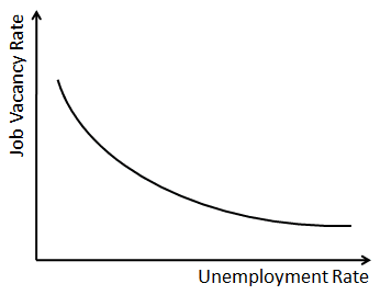
The Beveridge curve usually slopes downwards because times when there is high job vacancy in an economy are also marked by relatively low unemployment since companies may actually be actively looking to hire new people. By the same logic, a low job vacancy rate usually corresponds with high unemployment as companies may not be looking to hire many people in new jobs.
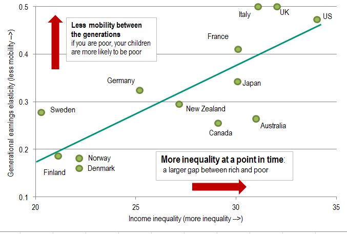
The "Great Gatsby Curve" describes the relationship between current income inequality and how hard it is for children to move up the economic ladder relative to their parents.
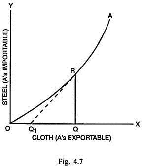
In economics and particularly in international trade, an offer curve shows the quantity of one type of product that an agent will export ("offer") for each quantity of another type of product that it imports. It is because of this reason that the offer curve is known also as the reciprocal demand curve. The offer curve was first derived by English economists Edgeworth and Marshall to help explain international trade.
The J Curve is an economic theory which states that, under certain assumptions, a country's trade deficit will initially worsen after the depreciation of its currency—mainly because higher prices on imports will be greater than the reduced volume of imports.
.jpg)
KEY TAKEAWAYS
The J Curve is an economic theory that says the trade deficit will initially worsen after currency depreciation.
Then the response to the curve, which is to an increase in imports as exports remain static, is a rebound, forming a “J” shape.
The J Curve theory can be applied to other areas besides trade deficits, including in private equity, the medical field, and politics.
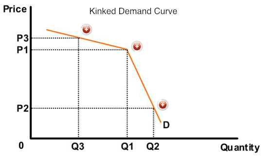
The kinked demand curve of oligopoly was developed by Paul M. Sweezy in 1939. The model explains the behavior of oligopolistic organizations. It advocates that the behavior of oligopolistic organizations remain stable when the price and output are determined.
|
An oligopoly is a market form wherein a market or industry is dominated by a small group of large sellers (oligopolists). Oligopolies can result from various forms of collusion that reduce market competition which then typically leads to higher prices for consumers. Oligopolies have their own market structure. |
This implies that an oligopolistic market is characterized by a certain degree of price rigidity or stability, especially when there is a change in prices in downward direction.
For example, if an organization under oligopoly reduces price of products, the competitor organizations would also follow it and neutralize the expected gain from the price reduction.
On the other hand, if the organization increases the price, the competitor organizations would also cut down their prices. In such a case, the organization that has raised its prices would lose some part of its market share.
The kinked demand curve model seeks to explain the reason of price rigidity under oligopolistic market situations.
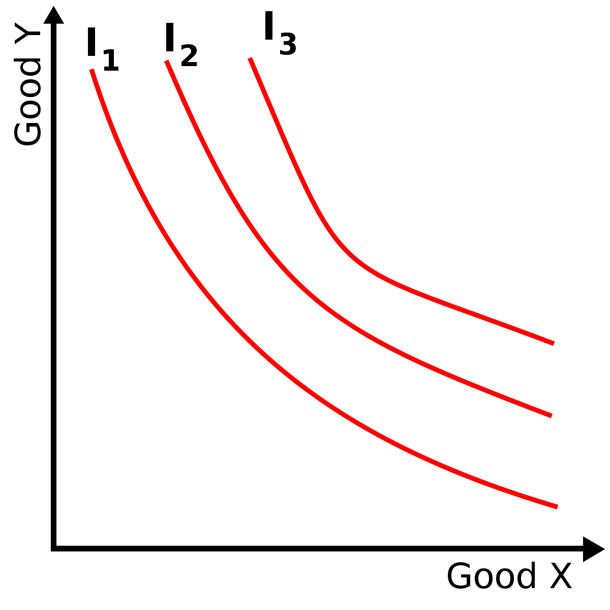
An indifference curve, with respect to two commodities, is a graph showing those combinations of the two commodities that leave the consumer equally well off or equally satisfied—hence indifferent—in having any combination on the curve.
KEY TAKEAWAYS
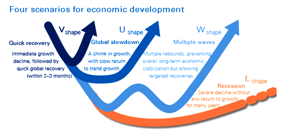
Economic recovery can take many forms, which is depicted using alphabetic notations. For example V-shaped recovery, U-shaped recovery, elongated U-shaped recovery, W-shaped recovery and L-shaped recovery.
The fundamental difference between the different kinds of recovery is the time taken for economic activity to normalize.
In this article, let’s try to take a brief look how L, V, U & W Shaped economic recovery compare.
An L–shaped recovery is a type of recovery characterized by a slow rate of recovery, with persistent unemployment and stagnant economic growth. L-shaped recoveries occur following an economic recession characterized by a more-or-less steep decline in the economy, but without a correspondingly steep recovery.
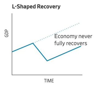
Example – Lost decade in Japan
What is known as the lost decade in Japan is widely considered to be an example of an L-shaped recovery. Leading up to the 1990s, Japan was experiencing remarkable economic growth. In the 1980s, the country ranked first for gross national production per capita. During this time, real estate and stock market prices were quickly rising. Concerned about an asset price bubble, the Bank of Japan raised interest rates in 1989. A stock market crash followed, and annual economic growth slowed from 3.89 percent to an average of 1.14 percent between 1991 to 2003.
In a V–shaped recession, the economy suffers a sharp but brief period of economic decline with a clearly defined trough, followed by a strong recovery. V-shapes are the normal shape for recession, as the strength of economic recovery is typically closely related to the severity of the preceding recession
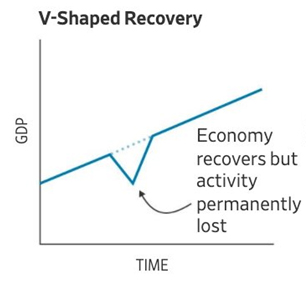
Example – The Recession of 1953
The recession of 1953 in the United States is another clear example of a V-shaped recovery. This recession was relatively brief, and mild with only a 2.2% decline in GDP and unemployment rate of 6.1%. Growth began to slow in the third quarter of 1953, but by the fourth quarter of 1954 was back at a pace well above the trend. Therefore, the chart for this recession and recovery would represent a V-shape.
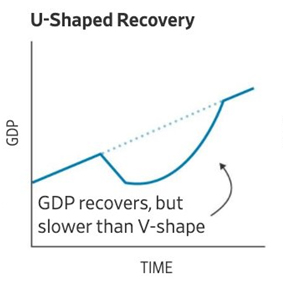
A U–shaped recovery describes a type of economic recession and recovery that charts a U shape, established when certain metrics, such as employment, GDP, and industrial output sharply decline and then remain depressed typically over a period of 12 to 24 months before they bounce back again.
A W-shaped recovery involves a sharp decline in these metrics followed by a sharp rise back upward, followed again by a sharp decline and ending with another sharp rise. The middle section of the W can represent a significant bear market rally or a recovery that was stifled by an additional economic crisis.
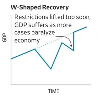
Example – US economy in 1980’s
The United States experienced a W-shaped recovery in the early 1980s. From January to July 1980 the U.S. economy experienced the initial recession, and then entered recovery for almost a full year before dropping into a second recession in 1981 to 1982.
© 2026 iasgyan. All right reserved